Movements: Research 2

Dialogue Studio, Movements

Next task for this brief is to choose one movement out of my three to develop further and base this project on, looking into typefaces, posters, textile, sculpture, architecture etc surrounding the movement. Feeling the most drawn to Washington Colour School, I researched that more but as it was so narrow I couldn’t find all the information I needed cause it simply doesn’t exist. So I changed to De Stijl as I felt I can work with that better and the movement is so much bigger, but looking into that more I realised I couldn’t engage with it fully as I didn’t like it whole heartedly. The typefaces used looks really bad and don’t inspire me at all and well.. all the information felt too accessible and too easy to find and it made me feel like a robot doing research as I didn’t have to think much myself.

So, standing in the library I glanced at a book by chance because it was next to the Dutch art books, picked it up and couldn’t leave without it.

kinetic

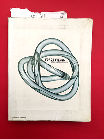
It’s a book about kinetic art through the 1900’s and looking through it I saw names I came across while researching for the Google Engage project (LeParc and Morellet) and felt like I had to look into this more as I find it very interesting and inspiring. Reading the book, it mentions some of my Zero movement artists such as Otto Piene, Lucio Fontana and Yves Klein. So that’s how I decided to choose Zero as my project. It’s weird but challenging and inspiring at the same time and I feel like I can interpret it in so many ways which is exciting.  

Movements: Research 1

Dialogue Studio, Movements

This project focuses on design history and movements. The deliverables will be a folded A2-A5 16 pager describing my exploration of chosen movement, and a motion graphic outcome. Starting off, I looked into 3 different movements I find interesting and chose De Stijl, Zero and The Washington Colour School.

De Stijl: Around 1917-1931 as a reaction to WWI, a group of Dutch artists set out to remake the world through a utopian vision and harmony and order. Exploring the ideal fusion of form and function, they wanted to eliminate all representational components, reducing painting to its elements: straight lines, plane surfaces, rectangles, and the primary colours red, yellow, blue, black and white. 

Map of Me: Research for Visual Identity Book

Dialogue Studio, Map of me

To accompany my app, I need to make a book explaining the visual identity of London Poetry. As I have no idea what usually goes in such a book, I started researching it and focused on three different companies: Apple Pay, The Barbican and Skype as I thought they were a good mix of digital and print stuff.

Apple Pay- divides their chapters in: overview, apple pay buttons, do’s and don’ts, avoid mistakes, examples.

The Barbican- introduction, logo, lock up, grid, typeface, typography (line space, weights) and then what their different posters look like for different events like art, film, theatre etc.

Skype- logo (what it looks like and do’s and don’ts), typeface, colours.

Based on this I’ve thought about what I need to incorporate and so this is my list: introduction, logo + do’s and don’ts, typeface and colours.


Google Engage: Outcome 2

Dialogue Studio, google engage

Having both my wave video and the built model of the pavilion, I put the two together in AE so you can see how the whole installation works. The waves will be projected onto the walls alongside some text that I have based my whole project on. As you walk through the pavilion you are surrounded by these huge walls that are 7-8 meters at their highest point, see the projections as you wander through it and also read the text to understand the purpose of it all. I want the experience to be like you are walking inside a crashing wave so scale is very important here and that nothing stands still.

Final DOOH- screen, by Lisa

Google Engage: Development 6

Dialogue Studio, google engage

It’s time to do my explainer video for this project. A video summarising everything from research, development and finally outcome- kind of like a pitch, the information can’t be too heavy and the message needs to come through quickly. After doing some research on explainer videos and different styles before I start my own I have come to the conclusion that I want to mix digital with handmade as that is exactly what I have done as my DOOH mockup so it fits. At first I thought about stop motion but as I want my white background to be stark white, that’s not a good idea (it’s crazy difficult to achieve) so that’s where the digital comes in and the wonders of AE. But to not lose the handmade bit I have decided to make small figures out of paper as my actors for the video so I get that stop motion vibe with out actually doing it as a stop motion.

Hopefully it will merge well with my mockup because I am having that in the video as well and have to think of how I can balance this so it doesn’t look bad.

Google Engage: Outcome 1

Dialogue Studio, google engage

For my abstract wave approach I started making some test videos to see how I could go about this. After several tries and experimenting in After Effects but not getting the result I wanted I felt a bit frustrated as I thought I could never get this to be what I wanted it to be. It either looked too light and flimsy or not regular enough but I got there eventually with the help of a tutorial that taught me how to transform sound into an abstract pattern that reacts to the wavelengths of the sound.

Wave experiments, by Lisa

Map of Me: Outcome 2

Dialogue Studio, Map of me

Now that I finally feel like I like my app idea to the point where I’m actually inspired, working on my screens went really quick. After one intense and productive day I now have an app concept and a prototype to show. Thinking about how to make my application interactive, I decided that I want the user to be able to do what I have done as well- create poems about their experience of London and make them into posters that you then can print. Making your poems into visuals. It works by you choosing the letter that you want for your poster, then you pick the colour and lastly you write your poem on it, add to gallery and print!

In terms of the design, I used the same 4 colours I had in my first prototype (blue, yellow, red, pink) for navigation as I think these also work for this idea. The font for the text is Avenir Next Medium and the letters I have manipulated are set in Big Caslon. I found out that I like the outcome of the manipulated type better when it’s set in serifs but as I am overall a very sans serif person and I needed a type that wasn’t so ornate for the rest of the text in the app to fit with the kind of strict and geometric design, I went with Avenir Next as it a bit rounded so it matches the curvyness I have going on with the posters. 

Map of Me: Development 5

Dialogue Studio, Map of me

This project has been on hold for a while for several reasons but the main one being that I still wasn’t happy with my idea and that has made it really difficult to continue with it. Doing more research, I went back to some of my original inspirations: Jessica Walsh and her usage of bright colours and a lot of blue, pink and purple, architectural photography focusing on geometry and angles (but this time I looked more into colour and minimalist photography) and text.

mood

Moodboard, by Lisa

Google Engage: Development 5

Dialogue Studio, google engage

Inside my pavilion I want something that give the walls more life and I was thinking about projecting a wave simulation on them with text explaining the connection with the leather theme. I did a test in After Effects creating “digital water” kind of but it still looked too static and a bit dull actually as seen below.

Water mockup test, by Lisa

So I looked more into how other types of waves can be visualised to make the water projection more abstract and dynamic. From researching heat waves, sound waves, light waves, magnetic waves and radio waves I made this moodboard as a summary of what I found: